
Logo
The Celebrations Logo
The logo for Vico Celebrations was conceived within the inter-institutional initiatives between the ISPF-CNR and the Academy of Fine Arts of Naples.
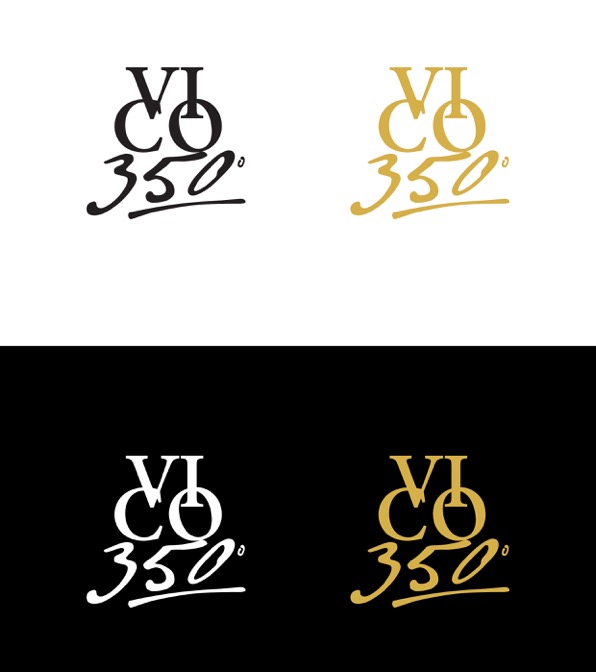
Fig. 1
On the occasion of the 350th anniversary of the birth of Giambattista Vico, the School of Communication Design of the Academy of Fine Arts in Naples, coordinated by Prof. Enrica D’Aguanno, took care of the conception and realization of the institutional image of the event. The students of the Graphic Design 3 course, under the guidance of Prof. Ivana Gaeta, were invited to propose their ideas during the 2016/17 academic year. Among the many proposals, the Communication Design Department selected the seven drawings more consistent with the character of the event, i.e. those of the students Davide Albanese, Federica Esposito, Valeria Ferone, Vincenzo Ferraro, Valentina Formato, Ferdinando Ragone and Fabio Simeone. Then (and not without difficulty, due to the high quality level of the selected works) the choice converged on the proposal by Davide Albanese, shown here in Figure 1.
This graphical idea has been developed starting from a first analysis and research phase, in which the author examined some documentary materials provided digitally by the ISPF-CNR, as the image of the painting of the frontispiece of New Science, some autograph writings by the Neapolitan philosopher and a commemorative stamp created for his three hundredth year anniversary. Hence the distinctive elements for the creation of the brand have been derived (Figure 2). The “triangulations” (a recursive numerical model in Vico philosophy) are used as a frame and a guide for the design. Consistent with a previous commemorative iconography, the composition of the word “VI CO” is the same, albeit revised, as that used for the three hundredth anniversary of his birth. While the number “350” was composed with the original signs found in the writings of the philosopher (Figures 2 and 3).
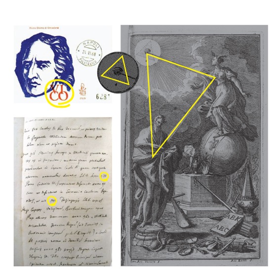
Fig. 2
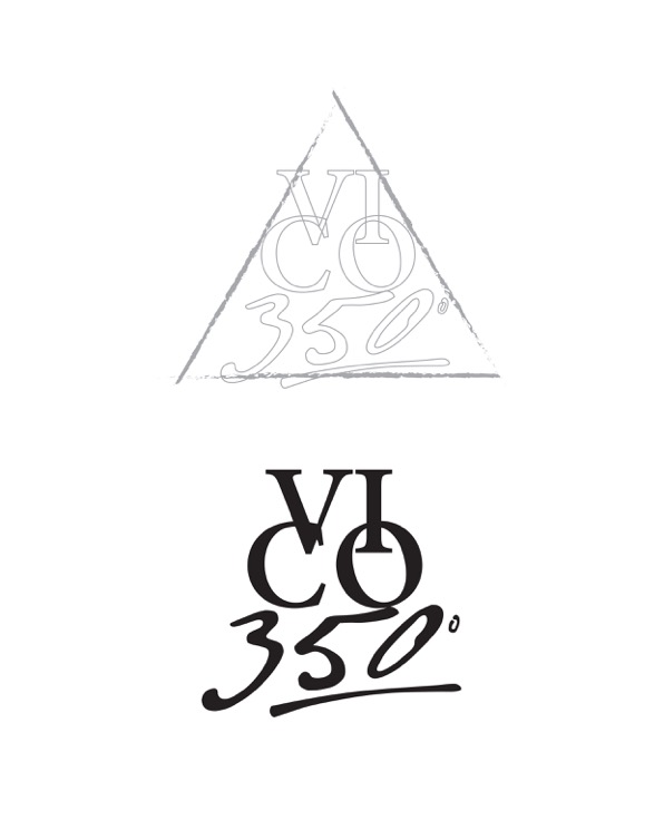
Fig. 3
The work, while using “classic” forms both in lettering and in colour (serif and gold-coloured fonts), aims to communicate a decidedly dynamic and visually striking message, intended to reflect the topicality of Giambattista Vico’s philosophy and its ability to dialogue with our time.
(We thank Ivana Gaeta and Dario Giugliano of the Academy of Fine Arts in Naples for the pictures and the informations)